
Swift Cheatsheet
Comments
Comments are notes for developers and are ignored by the compiler. Use // for
single-line comments and /* ... */ for multi-line comments.
// This is a single-line comment.
// It's useful for short explanations.

/*
 This is a multi-line comment.
 It can span several lines and is often
 used for longer descriptions or for temporarily
 disabling a block of code.
*/
let a = 5 // Comments can also be at the end of a line.
Output
Variable & Constant
Use var for data that can change (like a user's score) and let for
data that is set once and never changes (like a birth date).
Best Practice: Prefer
let over var. This makes your code safer and easier to understand
because it prevents accidental changes. Use var only when you explicitly need
to modify the value later.
var score = 0  // Variable (mutable)
let pi = 3.14  // Constant (immutable)

print("Initial score: \(score)")
score = 10  // Can change because it's var
print("New score: \(score)")
print("Pi value: \(pi)")
Output
New score: 10
Pi value: 3.14
Basic Data Types
Swift needs to know the "type" of data you are storing. Common types include text
(String), whole numbers (Int), decimals (Double),
true/false (Bool), and collections like arrays ([String],
[Int]).
Note: Swift has powerful type
inference, so you often don't need to write the type explicitly.
var name = "Alex" works just fine!
var name: String = "Alex"
var age: Int = 16
var height: Double = 1.75
var isStudent: Bool = true

// Arrays
var teamNames: [String] = ["Warriors", "Lakers", "Bulls"]
var scores: [Int] = [98, 102, 85]

// Print the values to see the output
print("Name: \(name)")
print("Age: \(age)")
print("Height: \(height)m")
print("Is student: \(isStudent)")
print("Team names: \(teamNames)")
print("Scores: \(scores)")
Output
Age: 16
Height: 1.75m
Is student: true
Team names: ["Warriors", "Lakers", "Bulls"]
Scores: [98, 102, 85]
String Interpolation
To mix text with variables or constants in Swift, use a backslash with parentheses:
\(yourVariable).
This works in strings for print statements and SwiftUI Text views.
let name = "Alex"
let age = 16
let score = 95

print("My name is \(name)")
print("I am \(age) years old")
print("\(name) scored \(score) points!")
Output
I am 16 years old
Alex scored 95 points!
If/Else Statements
Use if, else if, and else to make decisions in your
code based on certain conditions.
let temperature = 25
if temperature > 30 {
    print("It's a hot day!")
} else if temperature < 15 {
    print("It's a cold day.")
} else {
    print("The weather is mild.")
}
Output
For Loops
for-in loops allow you to repeat a block of code for each item in a sequence,
like an array or a range of numbers.
// Looping through an array
let names = ["Anna", "Alex", "Brian"]
for name in names {
    print("Hello, \(name)!")
}

// Looping through a range of numbers
for number in 1...3 {
    print("Number is \(number)")
}
Output
Hello, Alex!
Hello, Brian!
Number is 1
Number is 2
Number is 3
Random Numbers & Elements
Swift makes it easy to get random values, whether from a numerical range or from a collection
like an array. Use .randomElement() ?? defaultValue to safely pick from an
array.
// Random number in a range (e.g., 1 to 100)
let randomNumber = Int.random(in: 1...100)
print("Random number: \(randomNumber)")

// Random element from an array
let fruits = ["Apple", "Banana", "Cherry"]
let randomFruit = fruits.randomElement() ?? "No fruit!"
print("Random fruit: \(randomFruit)")

let emptyArray: [String] = []
let randomFromEmpty = emptyArray.randomElement() ?? "Default Value"
print("From empty: \(randomFromEmpty)")
Example Output
Random fruit: Apple (or Banana, Cherry)
From empty: Default Value
Functions
Functions are reusable blocks of code that perform a specific task. They can take inputs (parameters) and produce an output (return value).
Note: When calling a
function, you use an argument label (like a: and
b: below). Inside the function, you use the parameter name
(like a and b).
// Function with no parameters and no return value
func sayHello() {
    print("Hello, World!")
}
sayHello() // Call the function

// Function with parameters and a return value
func add(a: Int, b: Int) -> Int {
    return a + b
}
let sum = add(a: 5, b: 3)
print("Sum: \(sum)")
Output
Sum: 8
Switch Statements
A switch statement considers a value and compares it against several possible
matching patterns. It's a powerful alternative to long if-else if chains.
let dayOfWeek = 4
var dayName: String
switch dayOfWeek {
case 1:
    dayName = "Sunday"
case 2:
    dayName = "Monday"
case 3:
    dayName = "Tuesday"
case 4:
    dayName = "Wednesday"
default:
    dayName = "Other day"
}
print("Day \(dayOfWeek) is \(dayName).")
Output
Dictionaries
A dictionary stores associations between keys of the same type and values of the same type in a collection with no defined ordering.
// Creating and accessing a dictionary
var occupations = [
    "Malcolm": "Captain",
    "Kaylee": "Mechanic",
]
occupations["Jayne"] = "Public Relations"

print(occupations["Kaylee"] ?? "Unknown")

// Iterating over a dictionary
for (person, job) in occupations {
    print("\(person)'s job is \(job).")
}
Output
Malcolm's job is Captain.
Jayne's job is Public Relations.
Kaylee's job is Mechanic.
Optionals
Optionals handle the absence of a value. An optional says either "there is a value, and it
equals x" or "there isn’t a value at all" (nil). This prevents crashes from
using nil values.
Recommendation: Use
optional binding (if let) to safely unwrap and use a value. Use the
nil-coalescing operator (??) to provide a default value if the optional is
nil.
var optionalName: String? = "John Appleseed"
// optionalName = nil // It can also be nil

// 1. Shorthand optional binding (Swift 5.7+)
if let optionalName {
    print("Hello, \(optionalName)")
} else {
    print("Hello, guest!")
}

// 2. Nil-Coalescing Operator (Provides a default)
let greeting = "Hello, \(optionalName ?? "guest")"
print(greeting)
Output
Hello, John Appleseed
Structs vs. Classes
Both are blueprints for objects, but they have a key difference: Structs are
value types (copies are made), while Classes are
reference types (pointers to a shared instance).
Recommendation: Start
with structs for your data models. Use a class only when you need
features like inheritance or when multiple parts of your app must share and modify a single
instance of that data.
// Struct (Value Type) - a copy is made
struct User { var name: String }
var user1 = User(name: "Tom")
var user2 = user1
user2.name = "Jerry"
// user1 is unchanged
print("User1: \(user1.name), User2: \(user2.name)")

// Class (Reference Type) - both point to the same object
class Game { var score = 0 }
var game1 = Game()
var game2 = game1
game2.score = 50
// game1 is also changed
print("Game1 Score: \(game1.score), Game2 Score: \(game2.score)")
Output
Game1 Score: 50, Game2 Score: 50
Closures
Closures are self-contained blocks of functionality that can be passed around and used in your code. They can capture and store references to any constants and variables from the context in which they are defined.
let names = ["Chris", "Alex", "Ewa", "Barry", "Daniella"]

// Trailing closure syntax
let sortedNames = names.sorted { s1, s2 in
    s1 < s2
}
print(sortedNames)

// Shorthand argument names
let reversedNames = names.sorted(by: { $0 > $1 })
print(reversedNames)
Output
["Ewa", "Daniella", "Chris", "Barry", "Alex"]
Codable
The Codable protocol is a type alias for the Encodable and
Decodable protocols. It's used to easily encode and decode custom data types to
and from external representations like JSON. Codable belongs to Swift’s
standard library; this JSON example also uses Foundation.
import Foundation

struct Landmark: Codable {
    var name: String
    var foundingYear: Int
}

let jsonString = """
{
    "name": "Eiffel Tower",
    "foundingYear": 1887
}
"""
let jsonData = Data(jsonString.utf8)

let decoder = JSONDecoder()
if let landmark = try? decoder.decode(Landmark.self, from: jsonData) {
    print("\(landmark.name) was founded in \(landmark.foundingYear).")
}
Output
readLine()
Reads a line of text from the standard input, which is useful for command-line tools. It
returns an optional String, so you need to unwrap it safely.
print("What is your name?")
if let name = readLine() {
    print("Hello, \(name)!")
} else {
    print("No input provided.")
}
Example Interaction
User types: Jerry
Hello, Jerry!
SwiftUI Cheatsheet
Layout
VStack
Use VStack to arrange views in a vertical line, one on top of the other, like
stacking blocks.
VStack(spacing: 10) {
    Text("Item 1")
    Text("Item 2")
}
Output
HStack
Stacks views horizontally. Good for icons next to text.
HStack(spacing: 8) {
    Image(systemName: "star.fill")
    Text("My Hobby")
}
Output
Spacer
A Spacer is a flexible, invisible view that pushes other views as far apart as
possible. It's great for aligning things to the edges.
HStack {
    Text("Start")
    Spacer()
    Text("End")
}
Output
ZStack
Layers views on top of each other. Useful for backgrounds.
ZStack {
    Color.purple.ignoresSafeArea() // Background
    Text("Content on Top") // Foreground
        .foregroundStyle(.white)
}
Output
Combining Layouts
VStack, HStack, ZStack, and Spacer can be
nested and combined to create complex user interfaces. This example shows a card-like
structure.
ZStack(alignment: .topLeading) {
    // Background for the card
    Color.gray.opacity(0.1)
        .frame(width: 250, height: 150)
        .clipShape(.rect(cornerRadius: 10))

    VStack(alignment: .leading, spacing: 8) {
        HStack {
            Image(systemName: "star.fill")
                .foregroundStyle(.yellow)
            Text("Featured Item")
                .font(.headline)
            Spacer() // Pushes content left
        }
        Text("This item uses ZStack, VStack, HStack, and Spacer.")
            .font(.caption)
    }
    .padding() // Padding inside the VStack
}
.frame(width: 250, height: 150) // Frame for ZStack
Output
This item uses ZStack, VStack, HStack, and Spacer.
ScrollView
A scrollable view. You can specify the scroll direction (.vertical or
.horizontal). It's great for content that doesn't fit on one screen.
ScrollView {
    VStack(alignment: .leading, spacing: 10) {
        ForEach(0..50) { index in
            Text("Row \(index)")
        }
    }
}
.frame(height: 200) // Give the ScrollView a fixed height
Output
Row 0
Row 1
Row 2
...
Row 49
Views & Modifiers
Text("Hello")
Displays text on the screen.
Text("Your Name")
    .font(.title)
Output
Image("imageName")
Displays an image from your project's "Assets" folder.
Image("avatar1") // "avatar1" must be in Assets
    .resizable()
    .frame(width: 100, height: 100)
Output
100x100
Image(systemName: "...")
Displays an icon from Apple's SF Symbols library. These are vector-based and adapt well to different sizes and styles.
// Displaying various SF Symbols
VStack(spacing: 15) {
    Image(systemName: "star.fill")
    Image(systemName: "heart.circle.fill")
    Image(systemName: "trash.slash.fill")
    Image(systemName: "folder.badge.plus")
}
.font(.largeTitle) // Apply a consistent size
.foregroundStyle(.blue) // Apply a consistent color
Output
AsyncImage
Loads and displays an image from a URL asynchronously. It shows a placeholder while the image is loading.
AsyncImage(url: URL(string: "https://picsum.photos/id/237/200/300")) { image in
    image.resizable().scaledToFit()
} placeholder: {
    ProgressView() // Shows a loading spinner
}
.frame(width: 100, height: 100)
Output
(Image loaded from URL)
List { ... }
Creates a scrolling list of items. Often contains HStacks.
List {
    HStack {
        Image(systemName: "music.note")
        Text("Music")
    }
    HStack {
        Image(systemName: "film.fill")
        Text("Movies")
    }
}
.frame(height: 100) // Give the list a size
.listStyle(.plain)
Output (Simplified)
ProgressView
Displays a view that shows the progress of a task over time. It can be indeterminate (a spinner) or determinate (a progress bar).
VStack(spacing: 20) {
    // Indeterminate (spinner)
    ProgressView()

    // Determinate (progress bar)
    ProgressView(value: 0.75) {
        Text("Loading...")
    }
}
Output
Loading...
Advanced Views & Controls
Shapes (Circle, Rectangle)
SwiftUI provides several built-in shapes that you can use as views. They can be styled with
modifiers like .fill, .stroke, and .frame.
HStack(spacing: 20) {
    Circle()
        .fill(Color.blue)
        .frame(width: 80, height: 80)

    Rectangle()
        .stroke(Color.red, lineWidth: 5)
        .frame(width: 120, height: 80)
}
Output
Data Flow & Architecture
MVVM Design Pattern
The Model-View-ViewModel (MVVM) pattern separates your code into three parts: the Model (data), the View (UI), and the ViewModel (business logic), making your code cleaner and easier to manage. For iOS 17 and later, use Observation for view-model state.
import SwiftUI
import Observation

// ViewModel
@Observable
final class CounterViewModel {
    private(set) var count = 0
    func increment() { count += 1 }
}

// View
struct CounterView: View {
    @State private var viewModel = CounterViewModel()

    var body: some View {
        VStack {
            Text("Count: \(viewModel.count)")
            Button("Increment") { viewModel.increment() }
        }
    }
}
Observation Framework (@Observable)
On iOS 17 and later, @Observable is the preferred model-observation approach.
Store an owned model with @State, pass it normally, and use
@Bindable only when a child needs bindings to its properties.
import SwiftUI
import Observation

@Observable
final class Account {
    var owner = ""
}

struct AccountView: View {
    @State private var account = Account()

    var body: some View {
        AccountEditor(account: account)
    }
}

struct AccountEditor: View {
    @Bindable var account: Account

    var body: some View {
        TextField("Owner", text: $account.owner)
    }
}
@Binding
Creates a two-way connection between a property that stores data, and a view that displays
and changes it. It allows a child view to modify a @State property owned by its
parent.
struct ParentView: View {
    @State private var isToggleOn = false
    var body: some View { ChildView(isToggleOn: $isToggleOn) }
}

struct ChildView: View {
    @Binding var isToggleOn: Bool
    var body: some View { Toggle("Is On", isOn: $isToggleOn) }
}
@AppStorage
A SwiftUI property wrapper that reads and writes to UserDefaults. It's a
convenient way to persist small pieces of data, like user settings, across app launches.
// In a SwiftUI View
struct SettingsView: View {
    @AppStorage("username") var username: String = "Anonymous"

    var body: some View {
        VStack {
            Text("Welcome, \(username)!")
            Button("Log in") {
                username = "Taylor"
            }
        }
    }
}
Output
Legacy: @StateObject & @ObservedObject
These wrappers remain valid for models that use the older ObservableObject
protocol. Use @StateObject for an object a view owns and
@ObservedObject for one it receives. For new iOS 17+ code, prefer
@Observable, @State, and ordinary stored properties.
class UserProgress: ObservableObject {
    @Published var score = 0
}

struct GameView: View {
    // GameView creates and owns the progress object
    @StateObject private var progress = UserProgress()

    var body: some View {
        VStack {
            Text("Score: \(progress.score)")
            // Pass the object to a child view
            ScoreButton(progress: progress)
        }
    }
}

struct ScoreButton: View {
    // ScoreButton receives and observes the object
    @ObservedObject var progress: UserProgress

    var body: some View {
        Button("Increase Score") {
            progress.score += 10
        }
    }
}
@Environment with @Observable
For modern shared reference data, put an @Observable model into the environment
with .environment(model) and retrieve it by type with
@Environment(Model.self).
import SwiftUI
import Observation

@Observable
final class UserSettings {
    var username = "Anonymous"
}

@main
struct ExampleApp: App {
    @State private var settings = UserSettings()

    var body: some Scene {
        WindowGroup {
            SomeChildView()
                .environment(settings)
        }
    }
}

struct SomeChildView: View {
    @Environment(UserSettings.self) private var settings

    var body: some View {
        Text("Username: \(settings.username)")
    }
}
Framework Integrations
MapKit for SwiftUI
MapKit is a separate Apple framework with SwiftUI integration. On iOS 17 and later, control
the map with MapCameraPosition and add content such as
Marker using the map content builder.
import SwiftUI
import MapKit

struct MapView: View {
    private let campus = CLLocationCoordinate2D(
        latitude: 10.729,
        longitude: 106.694
    )

    @State private var position: MapCameraPosition = .region(
        MKCoordinateRegion(
            center: CLLocationCoordinate2D(latitude: 10.729, longitude: 106.694),
            span: MKCoordinateSpan(latitudeDelta: 0.01, longitudeDelta: 0.01)
        )
    )

    var body: some View {
        Map(position: $position) {
            Marker("RMIT Vietnam", coordinate: campus)
        }
        .frame(height: 200)
    }
}
Output
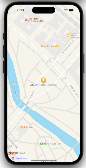
(Simulated Map View)
SwiftData
SwiftData is a separate persistence framework that integrates with SwiftUI. Use
@Model for persisted model types, @Query in views, and attach a
model container to the app or view hierarchy.
import SwiftUI
import SwiftData

@Model
final class DataItem {
    var name: String
    init(name: String) { self.name = name }
}

struct DataListView: View {
    @Query(sort: \DataItem.name) private var items: [DataItem]

    var body: some View {
        List(items) { item in
            Text(item.name)
        }
    }
}

// Add at the app or root-view level:
DataListView()
    .modelContainer(for: DataItem.self)
Core Data
Core Data is a separate model and persistence framework. It remains supported and is common in existing apps; SwiftData is generally the more concise choice for new Swift-first apps.
import SwiftUI
import CoreData

// In a SwiftUI view whose ancestor injects a managed object context
@Environment(\.managedObjectContext) private var context
@FetchRequest(sortDescriptors: [])
private var items: FetchedResults<Item>

Button("Add Item") {
    let newItem = Item(context: context)
    newItem.name = "New Item"

    do {
        try context.save()
    } catch {
        print("Save failed: \(error)")
    }
}
Firebase Authentication
Firebase Authentication is a third-party service, not SwiftUI. Import its product module and
use its async API from an asynchronous context such as a Task.
import FirebaseAuth

func signIn(email: String, password: String) async {
    do {
        let result = try await Auth.auth().signIn(
            withEmail: email,
            password: password
        )
        print("Signed in: \(result.user.uid)")
    } catch {
        print("Sign-in failed: \(error)")
    }
}
Cloud Firestore
Cloud Firestore is a third-party database. Its current Swift APIs support structured
concurrency with async/await.
import FirebaseFirestore

let database = Firestore.firestore()

func saveAndLoadUsers() async {
    do {
        try await database.collection("users").addDocument(
            data: ["name": "Ada"]
        )

        let snapshot = try await database.collection("users").getDocuments()
        for document in snapshot.documents {
            print(document.data())
        }
    } catch {
        print("Firestore error: \(error)")
    }
}
Common Modifiers (Your Superpowers!)
Modifier Order Matters
The order in which you apply modifiers is important. A modifier usually wraps the view and returns a new, modified view. Applying them in a different order can produce a different result.
// Example 1: Padding then Background
Text("Hello")
    .padding()
    .background(Color.red)

// Example 2: Background then Padding
Text("Hello")
    .background(Color.red)
    .padding()
Output
Custom Fonts
To use custom fonts, add the font file (e.g., .ttf or .otf) to your
project, register it in your Info.plist file, and then use it with the
.font(.custom(...)) modifier.
// 1. Add font file to project
// 2. Add "Fonts provided by application" key to Info.plist
// 3. Use in your view
Text("Custom Font!")
    .font(.custom("YourFontName-Regular", size: 24))
ViewModifier
Create reusable sets of modifiers by defining a custom ViewModifier. This helps
keep your code clean and consistent, especially for styles you apply often, like for buttons
or titles.
struct PrimaryTitleModifier: ViewModifier {
    func body(content: Content) -> some View {
        content
            .font(.largeTitle)
            .foregroundStyle(.blue)
            .padding()
            .background(Color.gray.opacity(0.2))
            .clipShape(.rect(cornerRadius: 10))
    }
}

// Usage
Text("Main Title")
    .modifier(PrimaryTitleModifier())
.font()
Changes text font and size.
E.g.,.font(.title),.font(.headline),.font(.system(size: 32, weight: .bold)),.font(.custom("Corinthia-Regular", size: 70)),.font(.custom("Silkscreen-Regular", size: 40)),.font(.custom("Sacramento-Regular", size: 50)).
.foregroundStyle()
Changes text or icon color.
E.g.,.foregroundStyle(.blue),.foregroundStyle(Color.white).
(Replaces the deprecated .foregroundColor(...) you may see in older
tutorials.)
.background()
Puts a colored background. E.g.,.background(Color.black.opacity(0.5)).
.padding()
Adds space around a view. E.g.,.padding() (all
sides),.padding(.horizontal) (left &
right),.padding([.top, .leading], 10) (specific sides & amount).
.clipShape()
Rounds the corners.
E.g.,.clipShape(.rect(cornerRadius: 15)),.clipShape(Circle()).
(Replaces the deprecated .cornerRadius(15) you may see in older
tutorials.)
.frame()
Gives a view a fixed size.
E.g.,.frame(width: 150, height: 150),.frame(height: 180).
.resizable()
(For Images) Allows the image to be resized.
.aspectRatio() / .scaledToFill()
(For Images) Controls how an image fills its frame.
E.g.,.aspectRatio(contentMode: .fill).
.clipShape()
(For Images) Clips the view into a shape. E.g.,.clipShape(Circle()).
.overlay()
Layers another view on top, often for borders.
E.g.,.overlay(Circle().stroke(Color.white, lineWidth: 4)).
.shadow()
Adds a drop shadow. E.g.,.shadow(radius: 10).
.offset()
Moves a view from its original position without affecting the layout of other views.
E.g.,.offset(x: 20, y: -10) moves the view 20 points right and 10 points
up.
.position()
Places the center of a view at a specific coordinate within its parent's coordinate space.
E.g.,.position(x: 100, y: 150).
For dynamic centering, use GeometryReader to get the parent's size:
GeometryReader { geometry in
    Text("Centered")
        .position(x: geometry.size.width / 2, y: geometry.size.height / 2)
}
.listStyle()
(For Lists) Changes list appearance. E.g.,.listStyle(.plain).
.ignoresSafeArea()
(For Colors/Backgrounds) Makes it fill the whole screen, even under notches.
E.g.,Color.black.ignoresSafeArea().
Modifier Combo: Styled Button Text
Combining modifiers to create a common button style with padding, background, corner radius, and text styling.
Text("Tap Me!")
    .font(.headline)
    .foregroundStyle(.white)
    .padding() // Add padding around the text
    .background(Color.blue) // Blue background
    .clipShape(.rect(cornerRadius: 10)) // Rounded corners
    .shadow(radius: 5) // Subtle shadow
Output
Modifier Combo: Circular Profile Image
Common pattern for profile images: resizable, specific frame, circular clip, and an overlay border.
Image("avatar1") // Assuming "avatar1" is in Assets
    .resizable()
    .scaledToFill() // Fill the frame, may crop
    .frame(width: 100, height: 100)
    .clipShape(Circle()) // Clip to a circle
    .overlay( // Add a border
        Circle().stroke(Color.orange, lineWidth: 4)
    )
    .shadow(radius: 7)
Output
Circular
Modifier Combo: Card View
Creating a card-like appearance using padding, background, corner radius, and shadow on a VStack.
VStack(alignment: .leading) {
    Text("Card Title")
        .font(.title2).bold()
        .foregroundStyle(.primary) // Use primary text color
    Text("This is some descriptive text for the card content. It explains what the card is about.")
        .font(.body)
        .foregroundStyle(.secondary) // Use secondary text color for subtlety
}
.padding() // Inner padding for content
.background(Color.gray.opacity(0.1)) // Light gray background, slightly transparent
.clipShape(.rect(cornerRadius: 12)) // Rounded corners for the card
.shadow(radius: 5) // Default shadow with a radius
.padding() // Outer padding to see shadow
Output
Card Title
This is some descriptive text for the card content. It explains what the card is about.
Visual & Transformational Effects
.opacity()
Controls the transparency of a view. A value of 1.0 is fully opaque, while 0.0 is fully transparent.
Text("Faded Text")
    .opacity(0.5)
Output
.rotationEffect()
Rotates a view by a specified angle. You can specify the angle in degrees or radians.
Text("Rotated")
    .rotationEffect(.degrees(-45))
Output
.scaleEffect()
Scales a view larger or smaller. A value of 1.0 is the original size.
Text("Bigger")
    .scaleEffect(1.5)
Output
.blur()
Applies a Gaussian blur effect to a view. The radius determines the intensity of the blur.
Text("Blurred")
    .blur(radius: 3.0)
Output
Gradients
Create smooth transitions between colors. Common types include LinearGradient,
RadialGradient, and AngularGradient.
VStack(spacing: 10) {
    LinearGradient(colors: [.blue, .white], startPoint: .top, endPoint: .bottom)
    RadialGradient(colors: [.yellow, .red], center: .center, startRadius: 5, endRadius: 50)
    AngularGradient(colors: [.green, .blue], center: .center)
}
.frame(height: 150)
Output
Interactivity & Animation
State & Actions
Use @State to store a value that can change. A Button can change
that value, and SwiftUI will automatically update the view.
@State private var tapCount = 0

VStack(spacing: 15) {
    Text("Taps: \(tapCount)")
    Button("Tap Me") {
        tapCount += 1
    }
}
Interactive Output
.onTapGesture { ... }
Makes any view tappable. Code inside the curly braces runs on tap.
// Add to an Image or Text view
Image("avatar1")
    .onTapGesture {
        // Action: what happens when tapped
        currentQuote = quotes.randomElement() ?? "Hmm..."
    }
Animation
SwiftUI provides two main ways to create animations: implicit animations using the
.animation() modifier, and explicit animations using the
withAnimation block.
@State private var isRotated = false

// Implicit Animation
Image(systemName: "arrow.up")
    .rotationEffect(isRotated ? .degrees(180) : .zero)
    .animation(.easeInOut, value: isRotated)

// Explicit Animation
Button("Rotate") {
    withAnimation {
        isRotated.toggle()
    }
}
.task() / .onAppear() / .onDisappear()
Use .task for asynchronous work tied to a view’s lifetime. Use
.onAppear for synchronous setup and .onDisappear for cleanup.
SwiftUI automatically cancels the task when the view disappears.
Text("My View")
    .task {
        await viewModel.load()
    }
    .onAppear {
        print("View appeared!")
    }
    .onDisappear {
        print("View disappeared!")
    }
Output
.sheet() & .presentationDetents()
Presents a view modally. Use .presentationDetents() to specify the height of the
sheet, such as half-screen (.medium) or full-screen (.large).
@State private var isShowingSheet = false

Button("Show Sheet") {
    isShowingSheet = true
}
.sheet(isPresented: $isShowingSheet) {
    MySheetView()
        .presentationDetents([.medium, .large])
}
Output
.alert()
Displays an alert message to the user, also controlled by a boolean @State
variable.
@State private var isShowingAlert = false

Button("Show Alert") {
    isShowingAlert = true
}
.alert("Important Message", isPresented: $isShowingAlert) {
    Button("OK", role: .cancel) { }
}
Output
Navigation
NavigationStack & NavigationLink
NavigationStack creates a navigation bar. NavigationLink is a
special button that pushes a new view onto the screen.
Note: older tutorials
use NavigationView, which is deprecated since iOS 16.
NavigationStack is the replacement and gives you more robust navigation
control.
NavigationStack {
    VStack {
        NavigationLink("Go to Detail") {
            Text("Detail View")
        }
    }
    .navigationTitle("Master View")
}
Output: Master → Detail View
Data-Driven Navigation
Use value-based links with .navigationDestination(for:) when navigation state
needs to be programmatic, restorable, or deep-linkable.
NavigationStack {
    List(destinations) { destination in
        NavigationLink(destination.name, value: destination)
    }
    .navigationDestination(for: Destination.self) { destination in
        DetailView(destination: destination)
    }
    .navigationTitle("Destinations")
}
Modal Presentation with .sheet()
Presents a view modally over the current one. This is a common way to handle self-contained tasks like logging in, creating a new item, or showing settings, without adding to the main navigation stack.
@State private var isShowingLoginSheet = false

VStack {
    Button("Log In") {
        isShowingLoginSheet = true
    }
}
.sheet(isPresented: $isShowingLoginSheet) {
    // The view to present modally
    LoginView()
}