🎯 Week 4 Learning Path
Follow the data through the app
ModelData creates the contacts, ContactList iterates over them,
ContactRow displays one summary, and ContactCard displays the selected
contact. Keeping that direction clear makes navigation and reuse much easier to reason about.
- Complete project setup and run the untouched app once.
- Build and preview each small reusable view with sample input.
- Create the model, then replace placeholder content with model properties.
- Render the collection with stable identity and add navigation.
- Add MapKit last, after list-to-detail navigation works.
Checkpoint: change one contact in ModelData. The same change should
appear in its row and detail screen without duplicated hard-coded text.
When stuck: temporarily preview the smallest failing view, check that the file belongs to the app target, and confirm the model property names and types before changing layout code.
🎯 Lab Objective & Tasks
Objective
The goal of this assignment is to recreate the demonstration given in the lecture and then make some small enhancements. It is important that you understand what you are doing with each step of recreating the demo from lecture so that you are prepared to do those enhancements. Mostly this is about experiencing the creation of a project in Xcode and typing code in from scratch. Type it in and watch what Xcode does as you do so.
💼 Your Task
This lab, please recreate your own Contact List version based on the list of your favourite people of contacts (could be real or fictional). This project is inspired from actual RMIT business card papers.

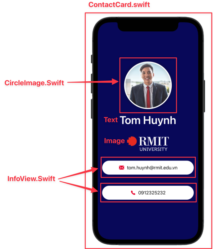
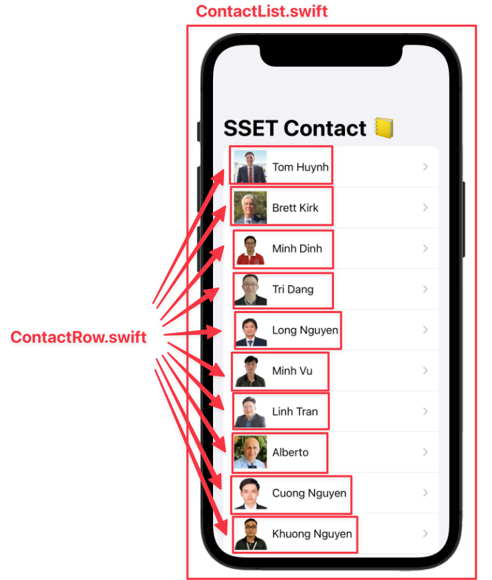
There are five main SwiftUI files like I showed in the lecture:
ContactCard.swift: display one contact card.CircleImage.swift: display the circle image of a profile photo.InfoView.swift: display a row of information fields.ContactList.swift: display a list of contact rows. (Wrapped by NavigationStack)ContactRow.swift: display one contact row in the list.
So you can take your time to create these basic views for the Contact List as below:
🐙 Github Integration in Xcode tips
🛠️ 1. Project Setup & File Organization
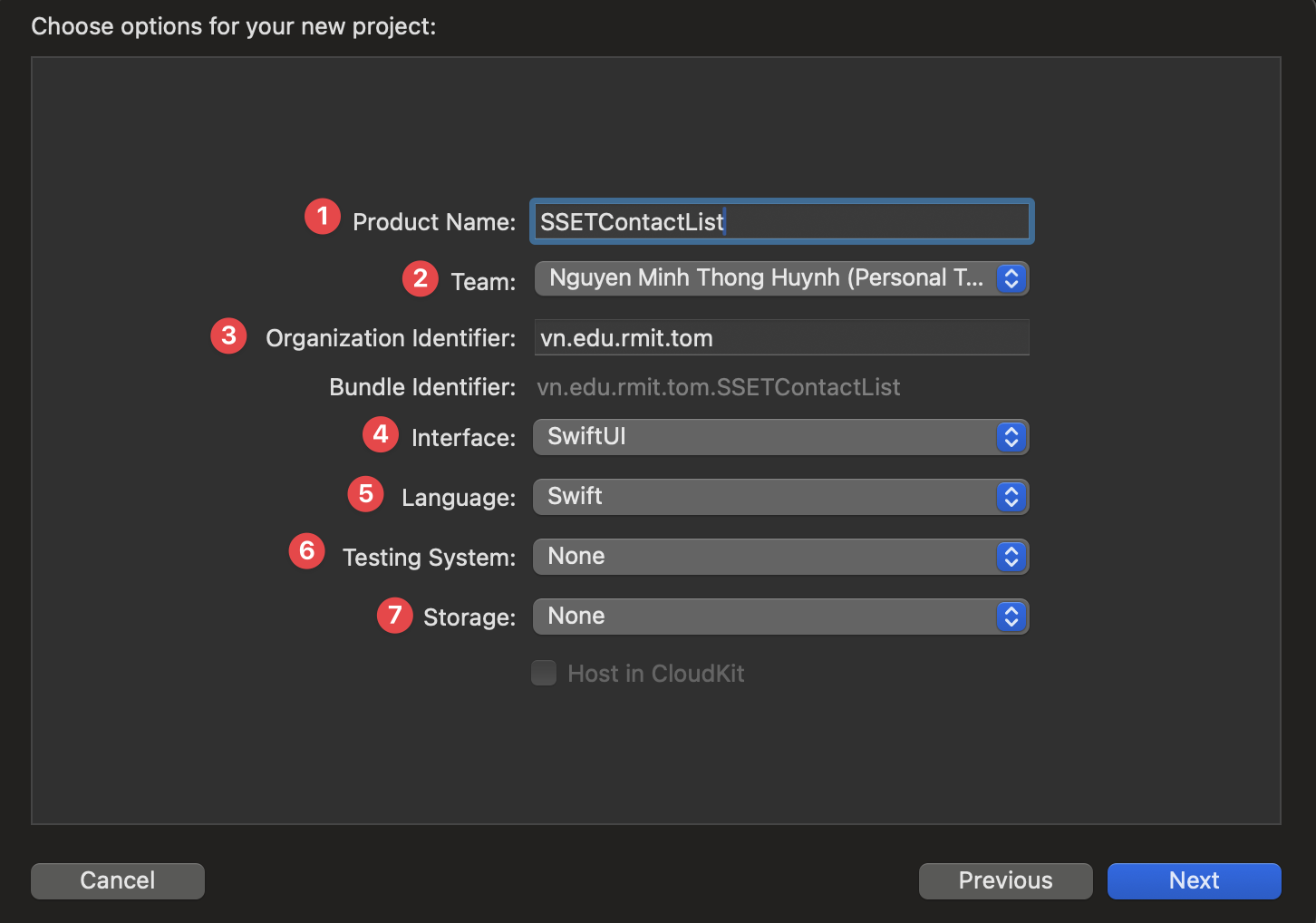
Step 1.1: Create a New Xcode Project
Instruction: Open Xcode, create a new project using the "App" template under iOS. Name it SSETContactList, ensure the Interface is "SwiftUI" and Language is "Swift".
Explanation: Every iOS application starts as an Xcode project. The "App" template provides the basic file structure for a SwiftUI application, including the app's entry point and a default content view.
Step 1.2: Organize Project Structure
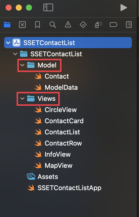
Instruction: For better organization, create two new folders in your project navigator: "Model" and "Views". This separates your data logic from your UI components.
Explanation: A clean project structure is crucial for maintainability.
Separating data (Model) from the user interface (Views) is a
fundamental concept in software development, often referred to as the
Model-View-ViewModel (MVVM) architecture, which SwiftUI is designed to work well with.
Step 1.3: Add Assets
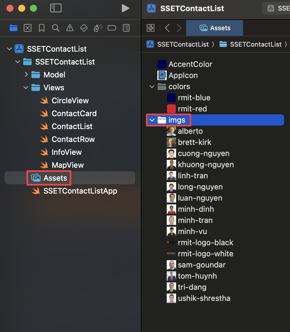
Instruction: Drag all the necessary images and color sets into your
Assets.xcassets file. Create subfolders for images (imgs) and
colors (colors) to keep them tidy.
Explanation: The Asset Catalog (.xcassets) is the central
place to manage all your app's visual assets. It automatically handles different device
resolutions (1x, 2x, 3x) and allows you to define named colors that can be used
throughout the app, making it easy to manage your app's theme.
Step 1.4: Add Colors
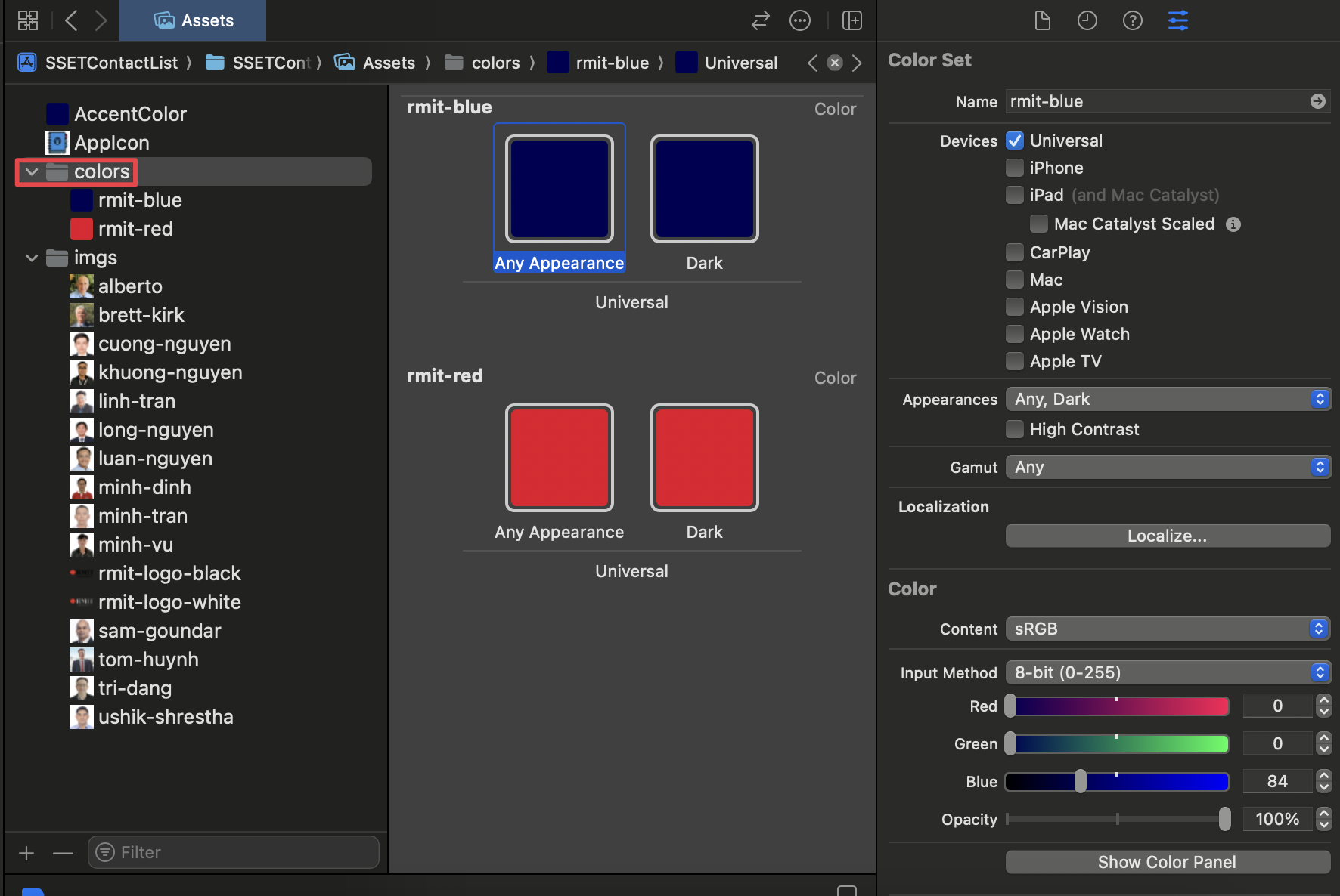
Instruction: In the Asset Catalog, you can also define custom colors for your app. Right-click in the asset list, select "New Color Set", and name it (e.g., "rmit-red"). You can then configure the color's value in the inspector.
Explanation: Using named colors from the Asset Catalog is a best practice. It allows you to manage your app's color scheme from a single location. If you decide to change a color later, you only need to update it in the Color Set, and the change will be reflected everywhere the color is used in your app. This is much more efficient than hardcoding color values in your code.
Step 1.5: Add the App Icon
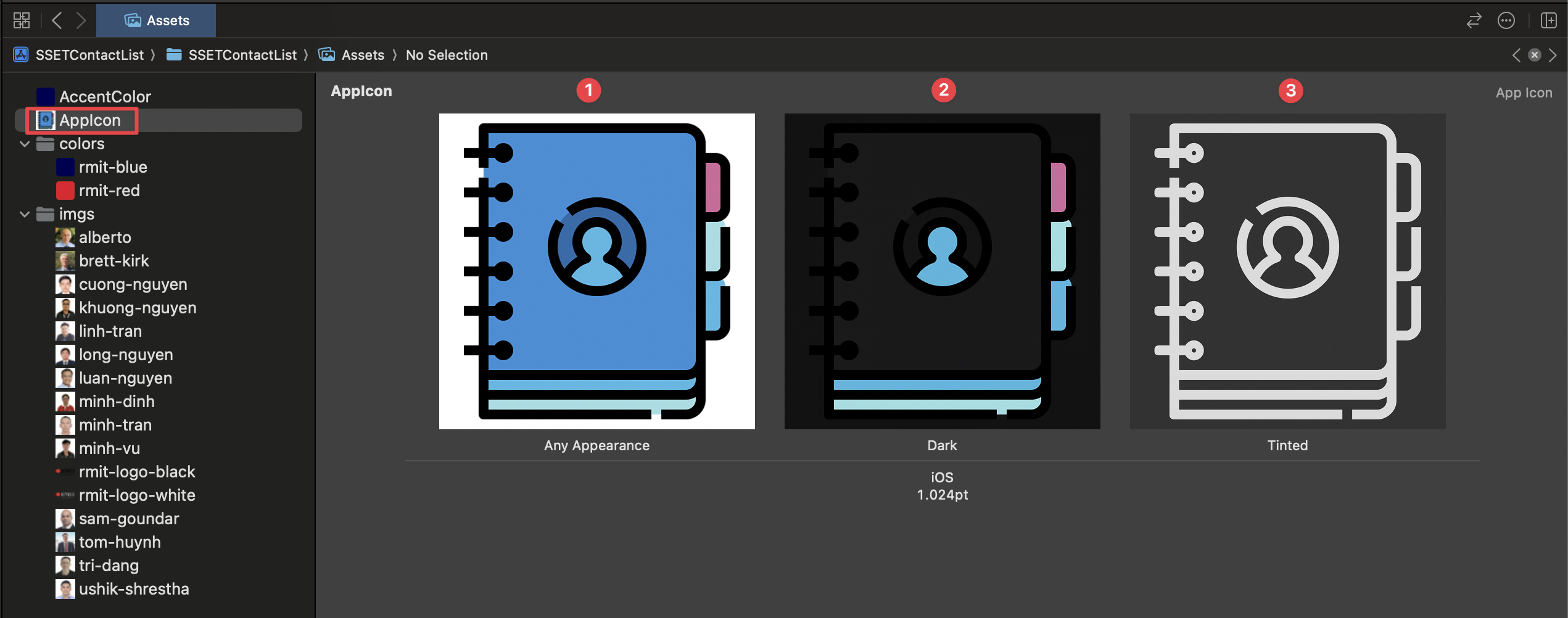
Instruction: In your Assets.xcassets, find the
AppIcon set. Drag your prepared 1024x1024 pixel app icon into the slots. Xcode
will automatically generate the other required sizes.
Explanation: The App Icon is a critical part of your app's identity. You must provide a high-resolution 1024x1024 pixel version for the App Store listing. For best results, use a tool like AssetKit to generate all the necessary sizes from your main image.
Preparing for iOS 18+ Dark and Tinted Modes
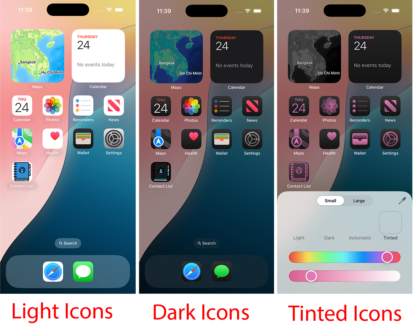
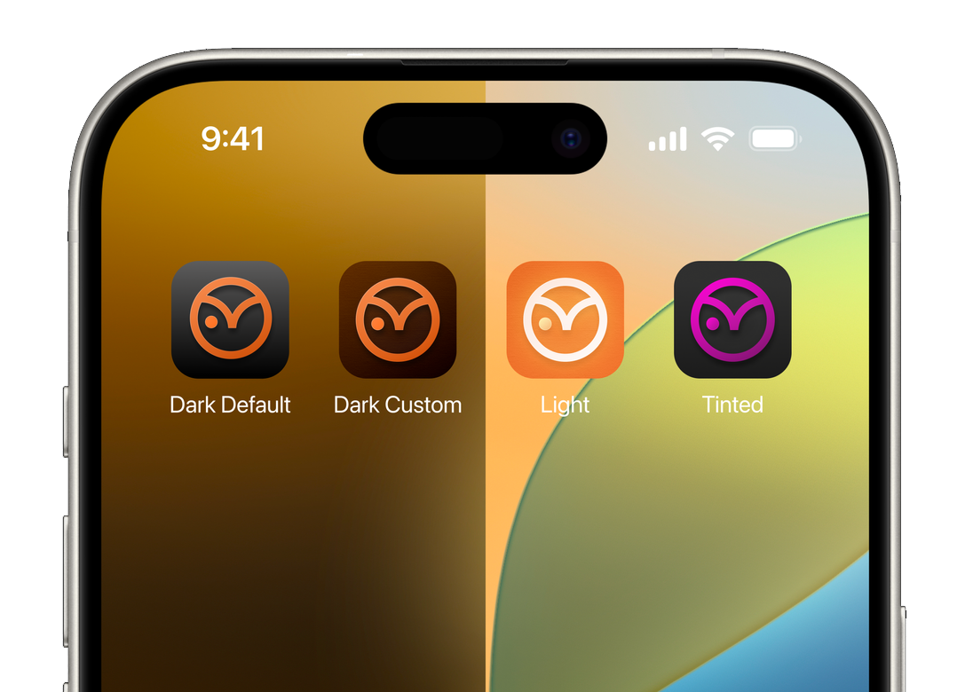
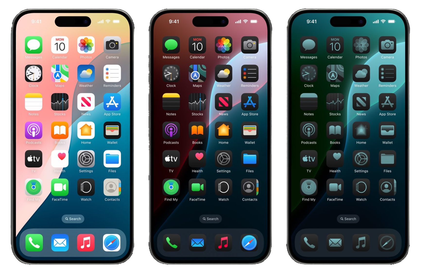
With iOS 18, users can customize app icons with Dark Mode and color tints. To ensure your app looks great, it's highly recommended to provide three variants of your icon in the AppIcon set:
- Light (Default): Your standard, primary app icon.
- Dark: A version adapted for Dark Mode. It should match the style of dark system icons. You can often achieve this by using your icon's main color in the foreground and either omitting the background (letting the system add a dark one) or providing a custom dark background.
- Tinted: A fully opaque, grayscale version of your icon. The system will apply user-selected color tints to this variant. If you don't provide a specific tinted version, the system will apply the tint over your original icon, which can produce unpredictable and undesirable results.
Providing these variants ensures your app icon remains clear, recognizable, and consistent across all appearance modes.
⚡ 2. Speed Run: The Finished Code, File by File
🏁 Is this the section you want?
This section is the destination, not the journey: every file of the completed app, already finished, grouped the way the lecture presented them. Open it if you:
- followed the live coding in the lecture and just need the final code to check against;
- are short on time and would rather get the app running now and study it afterwards;
- got stuck somewhere in the guided build below and want to compare one file with the finished version.
If this is your first time building this app, skip this section and go straight to 🐢 3. Guided Build. It produces exactly the same app, but one small runnable piece at a time, explaining every idea at the moment you first need it, which is the whole point of this lab.
Nothing changes step by step in here, so the only marks you will see are these:
📝 A. Setting Up the Data Model
Step A1: Create the Contact Struct
Instruction: Inside the "Model" folder, create a new Swift file named
Contact.swift. This struct will define the properties for each contact. It must
conform to Identifiable for use in SwiftUI Lists.
Explanation: A struct is a value type in Swift, perfect for
modeling data like a contact. By conforming to the Identifiable protocol, we
tell SwiftUI that each Contact instance has a unique id, which is
required for List views to efficiently track and update rows. The
image property is a computed property. Instead of storing a
value, it computes and returns an Image view based on the
imageName string, making it convenient to use directly in our views.
//
//  Contact.swift
//  ContactListLiveCode
//
//  Created by Tom Huynh on 22/7/25.
//

import Foundation
import SwiftUI
import CoreLocation

struct Contact : Identifiable {
    var id: UUID = UUID()
    var name: String
    var email: String
    var phone: String
    var imageName: String

    var image: Image {
        Image(imageName)
    }

    var locationCoordinate: CLLocationCoordinate2D
}
Step A2: Create ModelData
Instruction: Create another Swift file in the "Model" folder called
ModelData.swift. This file will hold the array of sample contact data that your
app will display.
Explanation: In a real app, this data might come from a database or a network request. For this tutorial, we are "hardcoding" the data into a global array. This makes it easy to access the sample data from any view in the app for prototyping and building the UI.
//
//  ModelData.swift
//  ContactListLiveCode
//
//  Created by Tom Huynh on 22/7/25.
//

import Foundation
import MapKit

let contacts: [Contact] = [
    Contact(name: "Tom Huynh", email: "tom.huynh@rmit.edu.vn", phone: "0912325232", imageName: "tom-huynh", locationCoordinate: CLLocationCoordinate2D(latitude: 10.729410965174186, longitude: 106.69522548892152)),
    Contact(name: "Brett Kirk", email: "brett.kirk@rmit.edu.vn", phone: "09435325634", imageName: "brett-kirk", locationCoordinate: CLLocationCoordinate2D(latitude: 10.758256325746386, longitude: 106.67228491141948)),
    Contact(name: "Minh Dinh", email: "minh.dinh4@rmit.edu.vn", phone: "0853453563", imageName: "minh-dinh", locationCoordinate: CLLocationCoordinate2D(latitude: 10.786710386116287, longitude: 106.73818415444727)),
    Contact(name: "Tri Dang", email: "tri.dangtran@rmit.edu.vn", phone: "0617486566", imageName: "tri-dang", locationCoordinate: CLLocationCoordinate2D(latitude: 10.79437079611712, longitude: 106.80394039521534)),
    Contact(name: "Long Nguyen", email: "long.nguyenminh@rmit.edu.vn", phone: "09624567254", imageName: "long-nguyen", locationCoordinate: CLLocationCoordinate2D(latitude: 10.870169083568735, longitude: 106.76307939055084)),
    Contact(name: "Minh Vu", email: "minh.vu@rmit.edu.vn", phone: "09346344534", imageName: "minh-vu", locationCoordinate: CLLocationCoordinate2D(latitude: 10.949713377874208, longitude: 106.8479555990988)),
    Contact(name: "Linh Tran", email: "linh.tranduc@rmit.edu.vn", phone: "0954634745", imageName: "linh-tran", locationCoordinate: CLLocationCoordinate2D(latitude: 11.04578475693659, longitude: 106.58373092288061)),
    Contact(name: "Alberto", email: "alberto@rmit.edu.vn", phone: "094354456", imageName: "alberto", locationCoordinate: CLLocationCoordinate2D(latitude: 10.803071448238558, longitude: 106.64427589071033)),
    Contact(name: "Cuong Nguyen", email: "cuong.nguyen@rmit.edu.vn", phone: "0922342355", imageName: "cuong-nguyen", locationCoordinate: CLLocationCoordinate2D(latitude: 10.781771420238698, longitude: 106.6306334151885)),
    Contact(name: "Khuong Nguyen", email: "khuong.nguyen@rmit.edu.vn", phone: "0945334613", imageName: "khuong-nguyen", locationCoordinate: CLLocationCoordinate2D(latitude: 10.745642963019284, longitude: 106.57460623743862)),
    Contact(name: "Luan Nguyen", email: "luan.nguyen@rmit.edu.vn", phone: "0925342356", imageName: "luan-nguyen", locationCoordinate: CLLocationCoordinate2D(latitude: 10.642054789728482, longitude: 106.43875526875854)),
    Contact(name: "Minh Tran", email: "minh.tran@rmit.edu.vn", phone: "0952534523", imageName: "minh-tran", locationCoordinate: CLLocationCoordinate2D(latitude: 10.23862895243684, longitude: 106.3776103458168)),
    Contact(name: "Sam Goundar", email: "sam.goundar@rmit.edu.vn", phone: "095534534", imageName: "sam-goundar", locationCoordinate: CLLocationCoordinate2D(latitude: 9.991073220047838, longitude: 106.0169751879182)),
    Contact(name: "Ushik Shrestha", email: "ushik.shrestha@rmit.edu.vn", phone: "0922345123", imageName: "ushik-shrestha", locationCoordinate: CLLocationCoordinate2D(latitude: 11.940952669293084, longitude: 108.45964507946036))
]
🧱 B. Building Reusable View Components
Step B1: Create CircleView
Instruction: In the "Views" folder, create a new SwiftUI View file named
CircleView.swift. This view takes an image and displays it as a styled circle.
Explanation: Creating small, reusable views like CircleView is
a core principle of SwiftUI. It keeps your code clean and allows you to reuse the same
styled component in multiple places. Here, we use modifiers:
.clipShape(Circle()) to make the image circular, .overlay() to add
a border, and .shadow() to give it depth. Notice also the use of the modern #Preview { ... } macro (introduced in Xcode 15 / Swift 5.9), which replaces the legacy PreviewProvider boilerplate.
//
//  CircleView.swift
//  ContactListLiveCode
//
//  Created by Tom Huynh on 22/7/25.
//

import SwiftUI

struct CircleView: View {
    var image: Image
    var body: some View {
        image
            .clipShape(Circle())
            .overlay(Circle()
                .stroke(Color("rmit-red"), lineWidth: 3))
            .shadow(color:Color("rmit-blue"), radius: 10)
    }
}

#Preview {
    CircleView(image: contacts[0].image)
}
Step B2: Create InfoView
Instruction: Create InfoView.swift in the "Views" folder. This
component is a reusable bar for displaying information like a phone number or email address.
Explanation: InfoView is another reusable component. It uses a RoundedRectangle as a background and an HStack to place an icon and text side-by-side. Notice the modern trailing closure syntax for .overlay { ... } (introduced in iOS 15+) as well as .foregroundStyle(...), which replaces the deprecated .foregroundColor(...) modifier for flexible tinting.
//
//  InfoView.swift
//  ContactListLiveCode
//
//  Created by Tom Huynh on 22/7/25.
//

import SwiftUI

struct InfoView: View {
    var text: String
    var imageName: String

    var body: some View {
        RoundedRectangle(cornerRadius: 25)
            .fill(Color.white)
            .frame(height: 50)
            .overlay{
                HStack{
                    Image(systemName: imageName)
                        .foregroundStyle(.rmitRed)
                    Text(text)
                        .foregroundStyle(.rmitBlue)
                }
            }
    }
}

#Preview {
    ZStack {
        Color("rmit-blue")
            .ignoresSafeArea()
        VStack {
            InfoView(text: "0123456789", imageName: "phone.fill")
            InfoView(text: "tom.huynh@rmit.edu.vn", imageName: "envelope.fill")
        }
    }
}
Step B3: Create MapView
Instruction: Create MapView.swift in the "Views" folder. This
view uses MapKit to display a location based on coordinates.
Explanation: In iOS 17+, SwiftUI introduced updated MapKit APIs that replace legacy region bindings. We use a @State private var position: MapCameraPosition property initialized inside init(location:) with an MKCoordinateRegion (span of 0.004). Binding $position to Map(position: $position) dynamically controls the camera, while Marker handles location pins seamlessly without needing older custom annotation wrappers.
//
//  MapView.swift
//  ContactListLiveCode
//
//  Created by Tom Huynh on 22/7/25.
//

import SwiftUI
import MapKit

struct MapView: View {
    let location: CLLocationCoordinate2D

    @State private var position: MapCameraPosition

    init(location: CLLocationCoordinate2D) {
        self.location = location

        let region = MKCoordinateRegion(
            center: location,
            span: MKCoordinateSpan(
                latitudeDelta: 0.004,
                longitudeDelta: 0.004
            )
        )

        _position = State(initialValue: .region(region))
    }

    var body: some View {
        Map(position: $position) {
            Marker("Location", coordinate: location)
        }
    }
}

#Preview {
    MapView(location: CLLocationCoordinate2D(latitude: 10.729227879505439, longitude: 106.69579948556701))
}
🎨 C. Assembling the Main Views
Step C1: Create ContactRow
Instruction: Create ContactRow.swift. This view defines the
layout for a single contact in the list.
Explanation: This view defines the appearance of each row in our contact
list. It takes a Contact object as input and uses an HStack to
arrange the contact's image and name horizontally. This view will be used by the
ContactList to build the scrollable list.
//
//  ContactRow.swift
//  ContactListLiveCode
//
//  Created by Tom Huynh on 22/7/25.
//

import SwiftUI

struct ContactRow: View {
    var contact: Contact

    var body: some View {
        HStack {
            contact.image
                .resizable()
                .scaledToFit()
                .frame(width: 50)
            Text(contact.name)
        }
    }
}

#Preview {
    VStack {
        ContactRow(contact: contacts[0])
        ContactRow(contact: contacts[1])
        ContactRow(contact: contacts[2])
        ContactRow(contact: contacts[3])
        ContactRow(contact: contacts[4])
    }
}
Step C2: Create ContactList
Instruction: Create ContactList.swift. This view uses a
NavigationStack and List to display all contacts from your
ModelData. NavigationLink handles tapping on a row.
Explanation: In iOS 16+, Apple introduced NavigationStack to replace the legacy NavigationView for superior performance and programmatic navigation. The List view takes our contacts array and creates a ContactRow for each item. Wrapped inside a NavigationLink, tapping any row pushes the corresponding ContactCard detail view onto the stack.
//
//  ContactList.swift
//  ContactListLiveCode
//
//  Created by Tom Huynh on 22/7/25.
//

import SwiftUI

struct ContactList: View {
    var body: some View {
        NavigationStack {
            List (contacts)  { contact in
                NavigationLink{
                    ContactCard(contact: contact)
                } label: {
                    ContactRow(contact: contact)
                }
            }
            .navigationTitle("SSET Contact List 📒")
        }
    }
}

#Preview {
    ContactList()
}
Step C3: Create ContactCard (Detail View)
Instruction: Create ContactCard.swift. This is the detail view
for a contact, combining the MapView, CircleView, and
InfoView components.
Explanation: This detail view integrates our reusable MapView, CircleView, and InfoView components using a ZStack and VStack layout. The .offset(y: -100) modifier overlaps CircleView onto MapView. Notice also the modern declarative toolbar styling modifiers (.toolbarBackground(Color("rmit-blue"), for: .navigationBar) and .toolbarColorScheme(.dark, for: .navigationBar)), which replace legacy UIKit navigation bar appearance code and ensure the back button renders cleanly in white.
//
//  ContentView.swift
//  ContactListLiveCode
//
//  Created by Tom Huynh on 22/7/25.
//

import SwiftUI

struct ContactCard: View {
    var contact: Contact
    var body: some View {
        ZStack {
            Color("rmit-blue")
                .ignoresSafeArea()
            VStack{
                MapView(location: contact.locationCoordinate)
                    .frame(height: 250)
                CircleView(image: contact.image)
                    .offset(y:-100)
                    .padding(.bottom, -100)
                Text(contact.name)
                    .font(.system(size: 40, weight: .bold, design: .serif))
                    .foregroundStyle(.white)

                Image("rmit-logo-white")
                    .resizable()
                    .scaledToFit()
                    .frame(width: 225)

                Group {
                    InfoView(text: contact.phone, imageName: "phone.fill")

                    InfoView(text: contact.email, imageName: "envelope.fill")
                }
                .padding()
            }
        }
        .toolbarBackground(
            Color("rmit-blue"),
            for: .navigationBar)
        .toolbarBackground(.visible, for: .navigationBar)
        .toolbarColorScheme(.dark, for: .navigationBar) // This makes the back button white
    }
}

#Preview {
    ContactCard(contact: contacts[0])
}
Step C4: Update the App Entry Point
Instruction: Finally, ensure your SSETContactListApp.swift file
is pointing to ContactList as the main view.
Explanation: The file marked with @main is the entry point of
the app. The WindowGroup is the scene that contains your app's view hierarchy.
We set its content to be an instance of ContactList, so that's the first screen
the user will see when they launch the app.
//
//  SSETContactListApp.swift
//  SSETContactList
//
//  Created by Tom Huynh on 24/7/25.
//

import SwiftUI

@main
struct SSETContactListApp: App {
    var body: some Scene {
        WindowGroup {
            ContactList()
        }
    }
}
🐢 3. Guided Build: One Small Piece at a Time (Recommended for Learning)
🧭 How this section works
This section builds exactly the same app as the Speed Run above, but in the order a developer would actually build it: one small piece at a time, where every step only uses things you have already met, and where you can hit ⌘R and see something real long before the app is finished.
Three rules make this work:
- Type it in, don't paste it. The point of this lab is watching Xcode react while you type: autocomplete, live errors, and the Canvas updating.
- Nothing arrives before it is needed. Part 1 has no data model at all. Parts
1 and 2 have no
MapKit, noCLLocationCoordinate2D, no latitude or longitude anywhere. Those are genuinely harder ideas, so they arrive last, once the app already works. - We revisit files. Real code is rewritten, not written once perfectly.
You will open
CircleView,ContactCard,ContactListandContactmore than once, and each visit will have a clear reason.
The roadmap
- Part 1 (Steps 1–8): one card, built by hand. New files:
CircleView.swift,InfoView.swift,ContactCard.swift. Result: a single business card on screen, with every value hardcoded. - Part 2 (Steps 9–17): data, a list, and navigation. New files:
Contact.swift,ModelData.swift,ContactRow.swift,ContactList.swift. Result: the complete app. Tap a name, see that person's card, tap back. - Part 3 (Steps 18–23): the map. New file:
MapView.swift, plus edits toContact,ModelDataandContactCard. Result: the finished app shown in the Speed Run section.
One note about the code blocks: Xcode writes the
// FileName.swift header comment for you when you create a file, so the
snippets below leave it out and show only the code you type.
How to read the code blocks
Each snippet marks the lines that matter for that step, so you never have to compare two blocks line by line to find what moved:
Unmarked lines are context you already typed earlier. When a step creates a brand-new file every line is new, so nothing is marked green there and only the lines worth pausing on are highlighted in blue.
🧩 Part 1 (Steps 1–8): One Card, Built by Hand
Goal of Part 1: get one business card on the screen for one
person, using three small views. No struct Contact, no array of data, no list,
no map. Just SwiftUI views and the assets you added in Section 1.
Step 1: Create CircleView.swift
Instruction: In the Project Navigator, right-click the
Views folder you created in Step 1.2 and choose New File from
Template… (just New File… in older Xcode versions)
→ iOS → SwiftUI View → Next. Name
it CircleView, check that it is being saved inside the
Views folder with the SSETContactList target ticked, and
click Create. Do not type anything yet. Just read what Xcode gave
you.
Explanation: The template creates a struct that
conforms to the View protocol. Conforming to View is a
promise: "I will provide a body property that describes what to draw".
The return type some View is an opaque type. It means
"one specific kind of view, and the compiler will work out exactly which one", so
you never have to spell out SwiftUI's long generic type names. The
#Preview macro at the bottom is what the Canvas on the right renders;
press ⌥⌘⏎ to show the Canvas and
⌥⌘P to resume it if it pauses. Keep the file name and
the struct name identical. Swift does not require it, but every iOS developer
expects it.
import SwiftUI

struct CircleView: View {
    var body: some View {
        Text("Hello, World!")
    }
}

#Preview {
    CircleView()
}
Step 2: Show a photo instead of text
Instruction: Replace Text("Hello, World!") with
Image("tom-huynh"), using the name of one of the image sets you dragged
into Assets.xcassets in Step 1.3.
Explanation: Image(_:) with a plain string looks the
name up in the Asset Catalog, and the catalog automatically hands back the @1x, @2x
or @3x version that suits the device. If the Canvas shows an empty square, the
string does not match an image set name exactly. The lookup is
case-sensitive and happens at runtime, not compile time, so Xcode will not warn
you.
struct CircleView: View {
    var body: some View {
        Image("tom-huynh")
    }
}
💡 If the photo looks enormous: an Image is drawn at
the size of its @1x asset unless you tell it otherwise. Either export smaller
assets, or temporarily add
.resizable().scaledToFit().frame(width: 250) after the image while you
work.
Step 3: Make the view reusable with a parameter
Instruction: Add a stored property var image: Image and
use it in the body instead of the hardcoded Image("tom-huynh"). Xcode
will immediately mark the #Preview as an error. Fix it by
passing an image in.
Explanation: A SwiftUI view is just a struct, and a
struct's properties are its inputs. Swift gives every struct a free
memberwise initializer, which is why CircleView(image:)
suddenly exists without you writing an init. This one change turns a
view that can only ever show Tom into a view that can circle-crop any
image: a photo now, and the RMIT logo later if you want.
struct CircleView: View {
    var image: Image

    var body: some View {
        image
    }
}

#Preview {
    CircleView(image: Image("tom-huynh"))
}
Step 4: Style it, one modifier at a time
Instruction: Add the three modifiers below one by one, watching the Canvas after each one.
Explanation: A modifier does not edit the view it is attached to and instead returns a new view that wraps the old one. That is why order matters: we crop first, then draw a ring on top of the cropped result, then cast a shadow around the whole thing.
First, crop the square photo into a circle:
image
    .clipShape(Circle())
Then draw a red ring on top. Circle() is a shape (which is itself a
view), .stroke() outlines it instead of filling it, and
.overlay() draws it over the image at the same size:
image
    .clipShape(Circle())
    .overlay(Circle()
        .stroke(Color("rmit-red"), lineWidth: 3))
Finally, add a soft blue glow. Color("rmit-red") and
Color("rmit-blue") are the named colours you defined in the Asset
Catalog in Step 1.4, so if you later change the shade there, every view updates at
once. Here is the finished file:
import SwiftUI

struct CircleView: View {
    var image: Image
    var body: some View {
        image
            .clipShape(Circle())
            .overlay(Circle()
                .stroke(Color("rmit-red"), lineWidth: 3))
            .shadow(color:Color("rmit-blue"), radius: 10)
    }
}

#Preview {
    CircleView(image: Image("tom-huynh"))
}
Because the image is a parameter, the same view happily takes a logo instead of a face, and that is what reusability buys you.
Step 5: Create InfoView.swift
Instruction: Create another SwiftUI View file in
the Views folder, named InfoView. Give it two stored
properties and, for now, just display the text.
Explanation: On the business card, the phone row and the email row
look identical apart from two things: the words, and the icon. So instead of writing
two views, we write one view with two inputs: text for the words and
imageName for the SF Symbol name. Deciding what varies is the
entire skill of building reusable components.
import SwiftUI

struct InfoView: View {
    var text: String
    var imageName: String

    var body: some View {
        Text(text)
    }
}

#Preview {
    InfoView(text: "0123456789", imageName: "phone.fill")
}
Step 6: Build the white info pill
Instruction: Turn the plain text into a white rounded bar with an icon, then fix the preview so you can actually see it.
Explanation: Read the body from the outside in:
RoundedRectangle(cornerRadius: 25): shapes are views. A shape greedily fills the space it is offered, so.frame(height: 50)pins its height while its width still stretches to fit the card..overlay { }draws content centred on top of the rectangle without changing the rectangle's size. (The trailing-closure form of.overlayarrived in iOS 15; older code passes the view as an argument, as we did inCircleView.)HStackputs the icon and the text side by side.Image(systemName:)loads an SF Symbol, Apple's built-in icon set; download the free SF Symbols app to browse the thousands of names such asphone.fillandenvelope.fill..foregroundStyle(.rmitRed): since Xcode 15, every asset gets a generated, type-safe Swift symbol: the colour set named"rmit-red"becomes.rmitRed. A typo here is a compile error, whereas a typo inColor("rmit-red")only shows up as a wrong colour at runtime. Both styles appear in this app so you recognise them; prefer the generated one.
White text bars on a white preview background are invisible, so the preview wraps
two InfoViews in a ZStack over the blue colour. A preview
is just a view, so you are free to build a small scene inside it.
import SwiftUI

struct InfoView: View {
    var text: String
    var imageName: String

    var body: some View {
        RoundedRectangle(cornerRadius: 25)
            .fill(Color.white)
            .frame(height: 50)
            .overlay{
                HStack{
                    Image(systemName: imageName)
                        .foregroundStyle(.rmitRed)
                    Text(text)
                        .foregroundStyle(.rmitBlue)
                }
            }
    }
}

#Preview {
    ZStack {
        Color("rmit-blue")
            .ignoresSafeArea()
        VStack {
            InfoView(text: "0123456789", imageName: "phone.fill")
            InfoView(text: "tom.huynh@rmit.edu.vn", imageName: "envelope.fill")
        }
    }
}
Step 7: Create ContactCard.swift and assemble the card
Instruction: Xcode already gave you a ContentView.swift
when it created the project. You can either rename it (click the file name in
the navigator, press ⏎, type ContactCard.swift,
then put the caret on the struct name and use Editor → Refactor →
Rename… so every usage is updated), or delete it and create a
fresh SwiftUI View file called ContactCard in the
Views folder. Then type the card below, with every value hardcoded for
one person.
Explanation: This is where the two components you just built get used. Working outwards:
ZStacklayers views back-to-front, so the blueColorsits behind everything as a background. AColoris a view that fills all offered space, and.ignoresSafeArea()lets it bleed under the notch and the home indicator.VStackstacks the card's contents vertically, in the order you write them..font(.system(size: 40, weight: .bold, design: .serif))asks for a 40-point bold serif system font. The serif design is what gives the name that printed-business-card feel.- On the logo,
.resizable()must come before.frame(), otherwise the image ignores the frame and draws at its natural size..scaledToFit()keeps its proportions. Group { }bundles the twoInfoViews so a single.padding()applies to both, instead of repeating the modifier.
Hardcoding the values is deliberate: you are looking at the layout, not at data.
Step 11 replaces all of it with a real Contact.
import SwiftUI

struct ContactCard: View {
    var body: some View {
        ZStack {
            Color("rmit-blue")
                .ignoresSafeArea()
            VStack{
                CircleView(image: Image("tom-huynh"))
                Text("Tom Huynh")
                    .font(.system(size: 40, weight: .bold, design: .serif))
                    .foregroundStyle(.white)

                Image("rmit-logo-white")
                    .resizable()
                    .scaledToFit()
                    .frame(width: 225)

                Group {
                    InfoView(text: "0912325232", imageName: "phone.fill")

                    InfoView(text: "tom.huynh@rmit.edu.vn", imageName: "envelope.fill")
                }
                .padding()
            }
        }
    }
}

#Preview {
    ContactCard()
}
Step 8: Run it on the simulator ✅
Instruction: Open SSETContactListApp.swift and point it
at your card for now. Choose an iPhone simulator in the toolbar and press
⌘R.
Explanation: The struct marked @main is the app's entry
point, and WindowGroup holds the first screen the user sees. If you
renamed ContentView in Step 7, this file still says
ContentView() and the project will not compile until you change it
and that is exactly the error students hit here. We will point it at the list
instead in Step 17.
import SwiftUI

@main
struct SSETContactListApp: App {
    var body: some Scene {
        WindowGroup {
            ContactCard() // temporary, becomes ContactList() in Step 17
        }
    }
}
Checkpoint: a real app, on a real simulator, showing one business card, built from two views you wrote yourself and can explain line by line. This is a great moment to make your first Git commit.
🗂️ Part 2 (Steps 9–17): Data, a List, and Navigation
Goal of Part 2: stop hardcoding. We describe what a contact is, create fourteen of
them, show them in a scrollable list, and let a tap push the matching card. Still no map
and nothing in this part mentions MapKit or coordinates.
Step 9: Create Contact.swift in the Model folder
Instruction: Right-click the Model folder →
New File from Template… → iOS → Swift
File (not SwiftUI View, since this file draws nothing) →
name it Contact.
Explanation: A struct is a value type: assigning it
copies it, so two parts of your app can never accidentally share and mutate the same
contact. That safety is why Swift models data with structs by default.
The first four properties are stored properties: real values
kept in memory. image is a computed property: it
stores nothing and instead builds an Image from
imageName every time it is read. That is a small but lovely
convenience: any view can write contact.image and never think about
asset names. It is also the reason a model file imports SwiftUI
because Image is a SwiftUI type.
Notice what is not here yet: no id, no
Identifiable, no location. Both are coming, each for a reason you will
feel first.
import Foundation
import SwiftUI

struct Contact {
    var name: String
    var email: String
    var phone: String
    var imageName: String

    var image: Image {
        Image(imageName)
    }
}
Step 10: Create ModelData.swift with sample contacts
Instruction: Add a second Swift File to the
Model folder called ModelData. Type in three or four of
your own contacts first, check the app still builds, then add the rest. Every
imageName must match an image set in
Assets.xcassets exactly.
Explanation: let contacts: [Contact] = [...] written at
the top level of a file (not inside a type) is a global constant:
any view in the app can read contacts without it being passed down. For
a small teaching app that is perfectly fine, and it makes previews trivial. In Part
2 of this lab you will replace this hardcoded array with data decoded from a JSON
file, and later in the course with @Observable view models.
You never write Contact(image:), because the memberwise initializer only
includes stored properties, and image is computed.
import Foundation

let contacts: [Contact] = [
    Contact(name: "Tom Huynh", email: "tom.huynh@rmit.edu.vn", phone: "0912325232", imageName: "tom-huynh"),
    Contact(name: "Brett Kirk", email: "brett.kirk@rmit.edu.vn", phone: "09435325634", imageName: "brett-kirk"),
    Contact(name: "Minh Dinh", email: "minh.dinh4@rmit.edu.vn", phone: "0853453563", imageName: "minh-dinh"),
    Contact(name: "Tri Dang", email: "tri.dangtran@rmit.edu.vn", phone: "0617486566", imageName: "tri-dang"),
    Contact(name: "Long Nguyen", email: "long.nguyenminh@rmit.edu.vn", phone: "09624567254", imageName: "long-nguyen"),
    Contact(name: "Minh Vu", email: "minh.vu@rmit.edu.vn", phone: "09346344534", imageName: "minh-vu"),
    Contact(name: "Linh Tran", email: "linh.tranduc@rmit.edu.vn", phone: "0954634745", imageName: "linh-tran"),
    Contact(name: "Alberto", email: "alberto@rmit.edu.vn", phone: "094354456", imageName: "alberto"),
    Contact(name: "Cuong Nguyen", email: "cuong.nguyen@rmit.edu.vn", phone: "0922342355", imageName: "cuong-nguyen"),
    Contact(name: "Khuong Nguyen", email: "khuong.nguyen@rmit.edu.vn", phone: "0945334613", imageName: "khuong-nguyen"),
    Contact(name: "Luan Nguyen", email: "luan.nguyen@rmit.edu.vn", phone: "0925342356", imageName: "luan-nguyen"),
    Contact(name: "Minh Tran", email: "minh.tran@rmit.edu.vn", phone: "0952534523", imageName: "minh-tran"),
    Contact(name: "Sam Goundar", email: "sam.goundar@rmit.edu.vn", phone: "095534534", imageName: "sam-goundar"),
    Contact(name: "Ushik Shrestha", email: "ushik.shrestha@rmit.edu.vn", phone: "0922345123", imageName: "ushik-shrestha")
]
Step 11: Feed a real Contact into ContactCard
Instruction: Give ContactCard a
var contact: Contact property and replace every hardcoded value with
contact.something. Then update three previews and the app entry
point. Xcode will list each error for you.
Explanation: This is the moment the app stops being a mock-up. One
view definition now renders fourteen different cards, because the data comes in from
outside instead of being baked in. contacts[0] in the preview simply
means "the first contact in the sample array", and previews are a fine place to
use sample data.
While you are here, update CircleView's preview to
CircleView(image: contacts[0].image) too. Now that a model
exists, the computed image property starts paying for itself. In the
app entry point, ContactCard() no longer compiles; change it to
ContactCard(contact: contacts[0]) for the moment.
import SwiftUI

struct ContactCard: View {
    var contact: Contact
    var body: some View {
        ZStack {
            Color("rmit-blue")
                .ignoresSafeArea()
            VStack{
                CircleView(image: contact.image)
                Text(contact.name)
                    .font(.system(size: 40, weight: .bold, design: .serif))
                    .foregroundStyle(.white)

                Image("rmit-logo-white")
                    .resizable()
                    .scaledToFit()
                    .frame(width: 225)

                Group {
                    InfoView(text: contact.phone, imageName: "phone.fill")

                    InfoView(text: contact.email, imageName: "envelope.fill")
                }
                .padding()
            }
        }
    }
}

#Preview {
    ContactCard(contact: contacts[0])
}
Step 12: Create ContactRow.swift
Instruction: Create a SwiftUI View file called
ContactRow in the Views folder. It draws one line of the
list: a small photo followed by a name.
Explanation: Same pattern as before: a
Contact comes in, a view comes out. The modifier trio is worth
memorising: .resizable() gives SwiftUI permission to change the
image's drawn size (without it, .frame() is ignored),
.scaledToFit() preserves the aspect ratio, and
.frame(width: 50) sets only the width so the height follows
automatically.
The preview stacks five rows in a VStack. That is a cheap way to see how
rows look together before a List exists, and it will keep
working as a design sandbox once one does.
import SwiftUI

struct ContactRow: View {
    var contact: Contact

    var body: some View {
        HStack {
            contact.image
                .resizable()
                .scaledToFit()
                .frame(width: 50)
            Text(contact.name)
        }
    }
}

#Preview {
    VStack {
        ContactRow(contact: contacts[0])
        ContactRow(contact: contacts[1])
        ContactRow(contact: contacts[2])
        ContactRow(contact: contacts[3])
        ContactRow(contact: contacts[4])
    }
}
Step 13: Create ContactList.swift, the first imperfect version
Instruction: Create a SwiftUI View file called
ContactList in the Views folder and type the code below
exactly, id: \.name included. Then, as an experiment, delete
, id: \.name and read the error Xcode gives you.
Explanation: List builds one row per element of an
array, and it needs a way to tell rows apart: to reuse them while scrolling,
to animate insertions and deletions, and to remember which row is selected. Right
now our Contact offers no such identity, so we point at a property
ourselves with a key path: \.name literally means "the
name property of whatever element you are looking at". Delete it and
the compiler tells you what it would prefer instead:
Referencing initializer 'init(_:rowContent:)' on 'List' requires
that 'Contact' conform to 'Identifiable'
Using the name as identity works, but it is fragile in two ways worth understanding, because they cause real bugs:
- Names are not unique. Add a second "Minh Tran" and two rows now claim the same identity, and SwiftUI gets confused about which is which.
- Names change. Fix a typo in a name and SwiftUI concludes the old contact vanished and a stranger appeared, throwing away that row's animation and selection state.
import SwiftUI

struct ContactList: View {
    var body: some View {
        List (contacts, id: \.name) { contact in
            ContactRow(contact: contact)
        }
    }
}

#Preview {
    ContactList()
}
Step 14: Make Contact conform to Identifiable
Instruction: Open Contact.swift, add
: Identifiable after the type name and an id property at
the top. Then go back to ContactList.swift and delete
, id: \.name.
Explanation: Identifiable is a protocol with exactly
one requirement: a property called id whose type is
Hashable. Once Contact satisfies that,
List and ForEach can ask each element for its own identity
and you never have to supply id: again.
Why UUID? A Universally Unique Identifier is a 128-bit value
with so many possible combinations that calling UUID() is treated as
guaranteed to produce a value nobody has ever seen. Writing
var id: UUID = UUID() gives the property a default
value, so every Contact silently gets its own fresh
identifier the instant it is created, which is why
ModelData.swift does not change by a single character, even though the
struct did.
A good id is unique and stable: it
must not repeat, and it must not change when the data changes. A random
UUID is both, which is exactly what name was not.
import Foundation
import SwiftUI

struct Contact : Identifiable {
    var id: UUID = UUID()
    var name: String
    var email: String
    var phone: String
    var imageName: String

    var image: Image {
        Image(imageName)
    }
}
And the list gets simpler, not more complicated, which is a good sign that the protocol was the right tool:
    var body: some View {
        List (contacts) { contact in
            ContactRow(contact: contact)
        }
    }
Step 15: Add navigation with NavigationStack and
NavigationLink
Instruction: Wrap the List in a
NavigationStack, wrap each row in a NavigationLink whose
destination is that contact's ContactCard, and add a
.navigationTitle.
Explanation: NavigationStack (iOS 16+, the replacement
for the deprecated NavigationView) manages a stack of screens: a link
pushes a new screen on, the back button pops it off, and you get
the slide animation, the back gesture and the navigation bar for free.
NavigationLink { destination } label: { whatTheUserTaps } is the modern
two-closure form: the first trailing closure is the screen to push, the
label: closure is the row itself. Because each row is created inside
the list's loop, each link captures its own contact, and
that is how tapping "Linh Tran" lands on Linh Tran's card. The grey chevron on the
right appears automatically because a NavigationLink sits inside a
List.
.navigationTitle is attached to the List, inside
the stack, not to the NavigationStack itself, because it configures the
bar for that particular screen, and each pushed screen can set its own.
import SwiftUI

struct ContactList: View {
    var body: some View {
        NavigationStack {
            List (contacts)  { contact in
                NavigationLink{
                    ContactCard(contact: contact)
                } label: {
                    ContactRow(contact: contact)
                }
            }
            .navigationTitle("SSET Contact List 📒")
        }
    }
}

#Preview {
    ContactList()
}
Step 16: Now that there is a navigation bar, style it on the card
Instruction: Add the three toolbar modifiers to
ContactCard. Note where they go: on the ZStack, at the
same level as the card's content, not inside the VStack.
Explanation: Until Step 15, ContactCard had no
navigation bar at all, so these modifiers would have done nothing, which is
precisely why we waited. Now that the card is pushed inside a
NavigationStack, iOS gives it a bar that is light and translucent by
default, with a blue back button that clashes badly with our dark blue card:
.toolbarBackground(Color("rmit-blue"), for: .navigationBar)paints the bar with the same blue as the card..toolbarBackground(.visible, for: .navigationBar)forces that background to be shown even when the content is scrolled to the top, where iOS would normally hide it..toolbarColorScheme(.dark, for: .navigationBar)tells iOS "this bar is dark", so the system draws the back button and title in white instead of black.
These declarative modifiers replaced the old UIKit
UINavigationBarAppearance dance. If you find that in an online
tutorial, it is out of date.
💡 Tip: ContactCard's own preview shows no bar, because
a preview has no navigation stack. Wrap the preview body in
NavigationStack { } if you want to check your colours without running
the whole app.
struct ContactCard: View {
    var contact: Contact
    var body: some View {
        ZStack {
            // ... the card content from Step 11, unchanged ...
        }
        .toolbarBackground(
            Color("rmit-blue"),
            for: .navigationBar)
        .toolbarBackground(.visible, for: .navigationBar)
        .toolbarColorScheme(.dark, for: .navigationBar) // This makes the back button white
    }
}
Step 17: Point the app at the list and run ✅
Instruction: Change SSETContactListApp.swift to show
ContactList(). The temporary ContactCard(...) from
Step 8 has done its job. Press ⌘R.
Explanation: The list is now the app's root screen, and every card is reached by tapping a row. This is also the moment to check your work on a real device if you have one.
import SwiftUI

@main
struct SSETContactListApp: App {
    var body: some Scene {
        WindowGroup {
            ContactList()
        }
    }
}
Checkpoint: you have a complete, working Contact List app. scroll the list, tap a name, read the card, tap back. Eight Swift files, a data model, a small library of reusable components and real navigation, and not one line of it is mysterious. Commit it to Git. Everything from here is a bonus feature.
🗺️ Part 3 (Steps 18–23): Adding the Map
Goal of Part 3: put each contact on the map. This is the part with genuinely new frameworks in it, CoreLocation for the coordinates and MapKit for the map, which is exactly why it comes last, when the rest of the app is finished and cannot be blamed for any errors you hit.
Step 18: Teach Contact where each person is
Instruction: In Contact.swift, add
import CoreLocation and one more stored property:
var locationCoordinate: CLLocationCoordinate2D. Expect errors
immediately. That is the plan.
Explanation: CLLocationCoordinate2D (the
CL prefix is CoreLocation) is a tiny value holding two
Doubles:
- latitude is how far north (+) or south (−) of the equator, from −90° to 90°. RMIT Saigon South is about 10.72°N.
- longitude is how far east (+) or west (−) of the Greenwich meridian, from −180° to 180°. Ho Chi Minh City is about 106.69°E.
CoreLocation is pure data with no UI at all, which is why it belongs in
the model rather than in a view. The moment you save, Xcode flags every
Contact(...) in ModelData.swift with "Missing argument
for parameter 'locationCoordinate'". That is the memberwise initializer
changing shape because the struct gained a stored property, and Step 19 fixes all
fourteen.
import Foundation
import SwiftUI
import CoreLocation

struct Contact : Identifiable {
    var id: UUID = UUID()
    var name: String
    var email: String
    var phone: String
    var imageName: String

    var image: Image {
        Image(imageName)
    }

    var locationCoordinate: CLLocationCoordinate2D
}
Step 19: Add coordinates to your sample data
Instruction: Add import MapKit to
ModelData.swift and give every contact a
locationCoordinate:. Do one contact, build, and only then do the rest.
Explanation: MapKit re-exports
CoreLocation, so importing either one makes
CLLocationCoordinate2D available here; we import MapKit because this
data exists to feed a map.
How to get real coordinates: open Google Maps in a browser, right-click any place, and the very first item in the menu is the latitude and longitude pair. Click it to copy. In Apple Maps, drop a pin and choose Share → Copy. Latitude always comes first; swapping the two is the classic beginner bug that drops your contact in the middle of the ocean.
import Foundation
import MapKit

let contacts: [Contact] = [
    Contact(name: "Tom Huynh", email: "tom.huynh@rmit.edu.vn", phone: "0912325232", imageName: "tom-huynh", locationCoordinate: CLLocationCoordinate2D(latitude: 10.729410965174186, longitude: 106.69522548892152)),
    Contact(name: "Brett Kirk", email: "brett.kirk@rmit.edu.vn", phone: "09435325634", imageName: "brett-kirk", locationCoordinate: CLLocationCoordinate2D(latitude: 10.758256325746386, longitude: 106.67228491141948)),
    Contact(name: "Minh Dinh", email: "minh.dinh4@rmit.edu.vn", phone: "0853453563", imageName: "minh-dinh", locationCoordinate: CLLocationCoordinate2D(latitude: 10.786710386116287, longitude: 106.73818415444727)),
    Contact(name: "Tri Dang", email: "tri.dangtran@rmit.edu.vn", phone: "0617486566", imageName: "tri-dang", locationCoordinate: CLLocationCoordinate2D(latitude: 10.79437079611712, longitude: 106.80394039521534)),
    Contact(name: "Long Nguyen", email: "long.nguyenminh@rmit.edu.vn", phone: "09624567254", imageName: "long-nguyen", locationCoordinate: CLLocationCoordinate2D(latitude: 10.870169083568735, longitude: 106.76307939055084)),
    Contact(name: "Minh Vu", email: "minh.vu@rmit.edu.vn", phone: "09346344534", imageName: "minh-vu", locationCoordinate: CLLocationCoordinate2D(latitude: 10.949713377874208, longitude: 106.8479555990988)),
    Contact(name: "Linh Tran", email: "linh.tranduc@rmit.edu.vn", phone: "0954634745", imageName: "linh-tran", locationCoordinate: CLLocationCoordinate2D(latitude: 11.04578475693659, longitude: 106.58373092288061)),
    Contact(name: "Alberto", email: "alberto@rmit.edu.vn", phone: "094354456", imageName: "alberto", locationCoordinate: CLLocationCoordinate2D(latitude: 10.803071448238558, longitude: 106.64427589071033)),
    Contact(name: "Cuong Nguyen", email: "cuong.nguyen@rmit.edu.vn", phone: "0922342355", imageName: "cuong-nguyen", locationCoordinate: CLLocationCoordinate2D(latitude: 10.781771420238698, longitude: 106.6306334151885)),
    Contact(name: "Khuong Nguyen", email: "khuong.nguyen@rmit.edu.vn", phone: "0945334613", imageName: "khuong-nguyen", locationCoordinate: CLLocationCoordinate2D(latitude: 10.745642963019284, longitude: 106.57460623743862)),
    Contact(name: "Luan Nguyen", email: "luan.nguyen@rmit.edu.vn", phone: "0925342356", imageName: "luan-nguyen", locationCoordinate: CLLocationCoordinate2D(latitude: 10.642054789728482, longitude: 106.43875526875854)),
    Contact(name: "Minh Tran", email: "minh.tran@rmit.edu.vn", phone: "0952534523", imageName: "minh-tran", locationCoordinate: CLLocationCoordinate2D(latitude: 10.23862895243684, longitude: 106.3776103458168)),
    Contact(name: "Sam Goundar", email: "sam.goundar@rmit.edu.vn", phone: "095534534", imageName: "sam-goundar", locationCoordinate: CLLocationCoordinate2D(latitude: 9.991073220047838, longitude: 106.0169751879182)),
    Contact(name: "Ushik Shrestha", email: "ushik.shrestha@rmit.edu.vn", phone: "0922345123", imageName: "ushik-shrestha", locationCoordinate: CLLocationCoordinate2D(latitude: 11.940952669293084, longitude: 108.45964507946036))
]
Step 20 (Optional but recommended): Try MapKit on its own in
MapTest.swift
Instruction: Create a throwaway SwiftUI View file
in Views called MapTest and put a map on the screen with
nothing else going on. This is the file from the lecture, borrowed from Apple's own
Landmarks tutorial, so it is centred on Joshua Tree National Park.
Explanation: Learning one new framework is much easier when nothing else can be at fault. Two types to meet:
MKCoordinateRegion= a center coordinate plus a span: "where to look" and "how much to show".MKCoordinateSpanis measured in degrees, not metres. One degree of latitude is roughly 111 km, so0.2frames a whole national park, while the0.004we use in the next step is about 450 m, which is street level. Smaller span = more zoomed in.
Map(initialPosition:) sets where the camera starts and then
hands control to the user, who can pan and zoom freely. Change the numbers, watch
the Canvas, and delete this file whenever you like, since nothing else depends on
it.
import SwiftUI
import MapKit


struct MapTest: View {
    // Center the map on Joshua Tree National Park.
    var region = MKCoordinateRegion(
            center: CLLocationCoordinate2D(latitude: 34.011_286, longitude: -116.166_868),
            span: MKCoordinateSpan(latitudeDelta: 0.2, longitudeDelta: 0.2)
        )


    var body: some View {
        Map(initialPosition: .region(region))
    }
}

#Preview {
    MapTest()
}
💡 The underscores in 34.011_286 are just Swift's
digit separators for readability, and the compiler ignores them.
Step 21: Create MapView.swift, the reusable map component
Instruction: Create a SwiftUI View file called
MapView in Views. Unlike MapTest, this one
takes the location as a parameter so any contact can use it.
Explanation: There are three new ideas here, and they are the trickiest few lines in the whole app, so take them slowly:
@State private var position: MapCameraPosition. The camera has to change while the view is on screen (the user drags and pinches), and views are structs that get thrown away and rebuilt constantly.@Statetells SwiftUI to own this value outside the struct and keep it alive across rebuilds. Passing$positiongives the map a binding, meaning two-way access, so the map can write the new camera back after every gesture.- The custom
init. We want the starting region to be built fromlocation, but one property cannot use another property's value in its default value. So we compute the region insideinitand assign the state's underlying storage directly:_positionis the hidden variable that@Stategenerates, andState(initialValue:)is the standard way to seed it from an initializer. - In
Map(position: $position) { Marker(...) }, the trailing closure is map content (iOS 17+), whereMarkerdrops the familiar balloon pin at a coordinate. This whole API replaced the olderMap(coordinateRegion:annotationItems:), so ignore tutorials that still use that.
A span of 0.004 in both directions gives that close, street-level view
that makes the card feel personal. Try 0.05 to see the whole
district.
import SwiftUI
import MapKit

struct MapView: View {
    let location: CLLocationCoordinate2D

    @State private var position: MapCameraPosition

    init(location: CLLocationCoordinate2D) {
        self.location = location

        let region = MKCoordinateRegion(
            center: location,
            span: MKCoordinateSpan(
                latitudeDelta: 0.004,
                longitudeDelta: 0.004
            )
        )

        _position = State(initialValue: .region(region))
    }

    var body: some View {
        Map(position: $position) {
            Marker("Location", coordinate: location)
        }
    }
}

#Preview {
    MapView(location: CLLocationCoordinate2D(latitude: 10.729227879505439, longitude: 106.69579948556701))
}
Step 22: Put the map on the card and lift the photo over it
Instruction: In ContactCard.swift, add the
MapView as the first item in the VStack, then add two
modifiers to the CircleView below it.
Explanation: Three lines, three separate ideas. Comment each one out in turn and watch what breaks, it is the fastest way to understand SwiftUI layout:
.frame(height: 250)on the map: aMapis greedy and would happily take the entire screen, so we give it a fixed band at the top..offset(y: -100)on the circle moves the circle up visually only. Offset happens after layout, so theVStackstill reserves the circle's original slot, leaving a 100-point hole underneath..padding(.bottom, -100)uses negative padding to remove exactly that reserved space, pulling the name and everything below it back up. The pair together produce the overlapping business-card look.
Here is the finished ContactCard.swift, toolbar modifiers from Step 16
included:
import SwiftUI

struct ContactCard: View {
    var contact: Contact
    var body: some View {
        ZStack {
            Color("rmit-blue")
                .ignoresSafeArea()
            VStack{
                MapView(location: contact.locationCoordinate)
                    .frame(height: 250)
                CircleView(image: contact.image)
                    .offset(y:-100)
                    .padding(.bottom, -100)
                Text(contact.name)
                    .font(.system(size: 40, weight: .bold, design: .serif))
                    .foregroundStyle(.white)

                Image("rmit-logo-white")
                    .resizable()
                    .scaledToFit()
                    .frame(width: 225)

                Group {
                    InfoView(text: contact.phone, imageName: "phone.fill")

                    InfoView(text: contact.email, imageName: "envelope.fill")
                }
                .padding()
            }
        }
        .toolbarBackground(
            Color("rmit-blue"),
            for: .navigationBar)
        .toolbarBackground(.visible, for: .navigationBar)
        .toolbarColorScheme(.dark, for: .navigationBar) // This makes the back button white
    }
}

#Preview {
    ContactCard(contact: contacts[0])
}
Step 23: Final check, compare against the finished project ✅
Instruction: Run the app, tap through a few contacts, and confirm each card shows that person's own neighbourhood. Then compare your files with the Speed Run section above. They should now match line for line.
Your project should look like this:
SSETContactList/
├── Model/
│   ├── Contact.swift
│   └── ModelData.swift
├── Views/
│   ├── CircleView.swift
│   ├── ContactCard.swift
│   ├── ContactList.swift
│   ├── ContactRow.swift
│   ├── InfoView.swift
│   ├── MapTest.swift      // optional sandbox from Step 20, safe to delete
│   └── MapView.swift
├── Assets.xcassets/
└── SSETContactListApp.swift
Explanation: Look back at what each part bought you. Part 1 gave you reusable views. Part 2 gave you a model, identity and navigation, plus a fully working app. Part 3 added a whole new framework to something that already worked, so any error could only have come from the new code. That order is not a teaching trick; it is how experienced developers keep themselves out of trouble.
Now head to Section 4 and make the app your own.
✨ 4. Customization & Enhancements
⭐ Primary Required Features
- Complete the basics as shown in the lecture.
- Please select your own icon and your people's images and contact info in the list.
- Add your own logo (could be RMIT logo or something else).
- Generate the app icons and image assets for the Xcode project.
- Try different design for the contact card:
- Different color backgrounds.
- Different layouts of fields.
- Your RMIT student number
- Your address.
- Add different SF symbols at the end of the contact card to show what kind of personality they have! Like a gamer person should have a bunch of gaming icons of SF Symbols.
- Try different fonts as you like.
- Deploy the app on your phone to test it out!
- Push your project to your personal Github and add the README file like my Github repo example (https://github.com/TomHuynhSG/SSETContactList) (map branch which includes the map feature). By the end of the course, you will have multiple Github repo ready and polished so it would be helpful when you apply for jobs and need show off projects to employers or interviewers.
🔗 Useful Links
🗺️ 5. Second Map App: Creating a Dynamic Location Map App for Saigon and Hanoi with SwiftUI
🎯 Objective
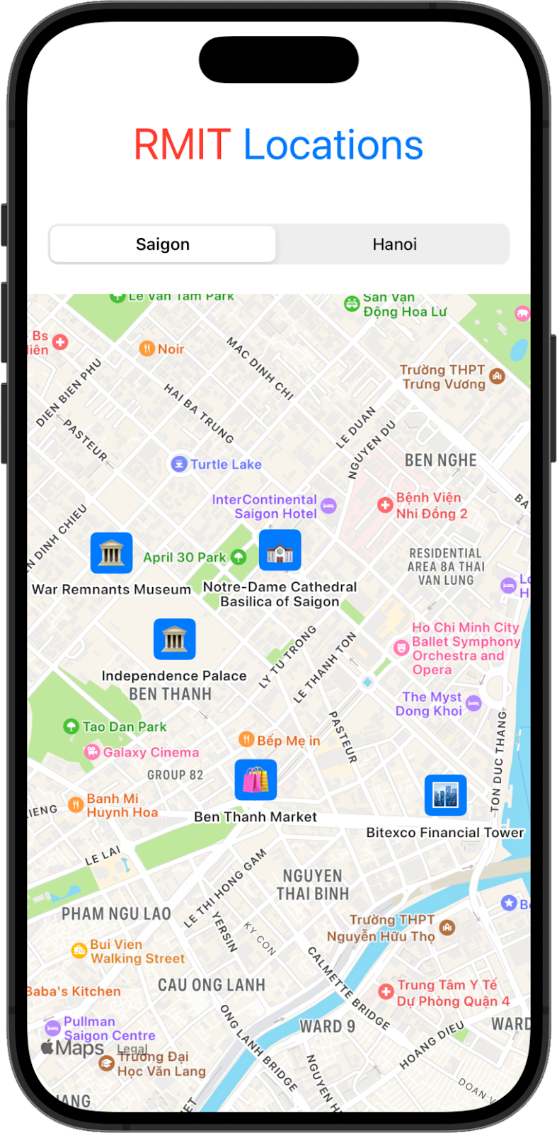
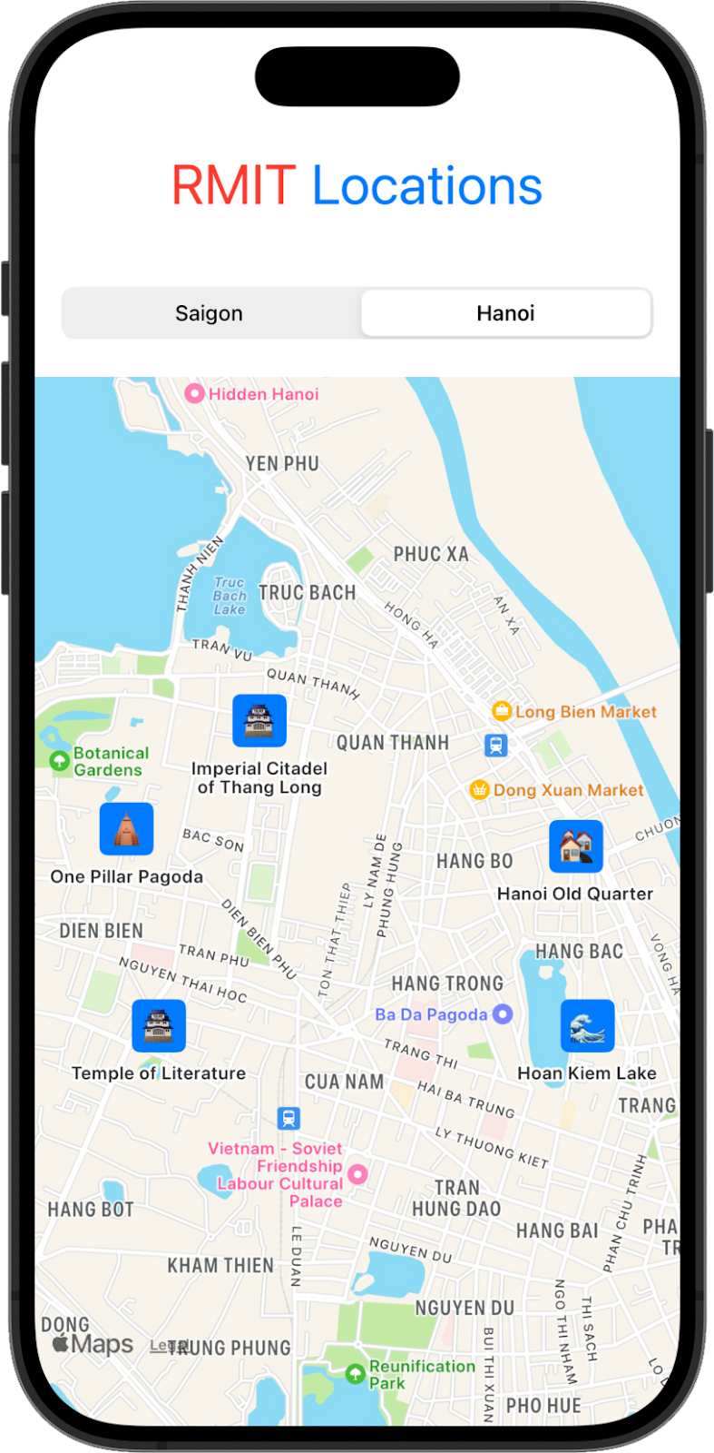
Create a SwiftUI app that dynamically displays popular locations in Saigon and Hanoi on a map. Use MapKit to create custom annotations with emojis, and add a picker to switch between cities.
Requirements
- Map View with Custom Annotations: Create a map and add 5 custom annotations (with emojis) for popular locations in both Saigon and Hanoi.
- City Selection: Add a segmented picker to switch between Saigon and Hanoi, updating the map dynamically.
- Logo and Styling: Add a styled "RMIT Locations" logo.
- Data Handling: Use
CLLocationCoordinate2Dfor locations and organize the data for easy switching.